
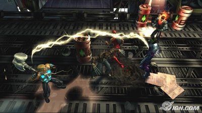
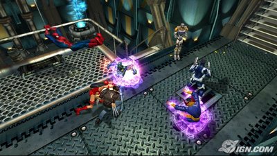
Wii VERSION BELOW
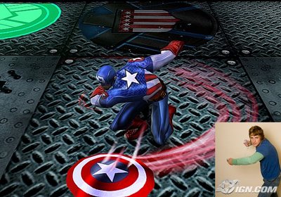
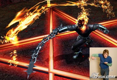
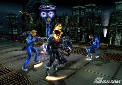
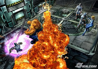
XBOX VERSION BELOW
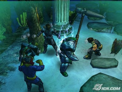

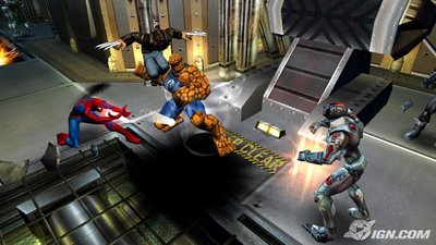
Note that the Wii pics are actually confirmed by IGN Wii as being the first REAL Wii version shots in action. In my opinion, the Wii version looks closer to the 360 version than the current gen version. The Wii version was supposed to be using the same engine as current gen as well. If it is the current gen engine, I must say that they are doing a really good job of making it look close to next gen and not just the same old same old for current gen systems. Nice to see Activision putting 16:9 and pro-scan in the game as well.
Want to know how the Wii version plays? Go here for the story

8 comments:
IGN Wii also announced Splinter Cell: Double Agent as a Wii launch title today as well! This is just wonderful news and I would have put it as the top post, but since I figured that everyone else is already doing that with their blogs, I would try to put a more unique post up with the screen comparisons of Ultimate Alliance.
No doubt this is going to be one of the best, if not THE best console launch ever in videogame history. Get your money ready to spend because even Ultimate Alliance is looking almost worth buying now.....so many games to play and so little time. Its all coming soon.
I'm not convinced that the Wii version is using the current-gen engine because it looks absolutely nothing like it.
It doesn't look like it does to me either, but that is what the developer said a few months ago. They could be using the same levels with much better textures, and maybe they put in all new characters that look a lot more like the 360 version. Its looking good for the Wii though.
Sad to say you may be right Jadnice. GT Pro looks rushed and not ANY different than the Gamecube version released in Japan. It may be a fun game but right now I'm not very interested in that one.
Great comparrison! I will be posting this story on my site and giving you props my man. Keep up the GREAT work. I too think that the Wii version looks the best out of all of them.
If you compare the fire coming out of Ghost Rider's head on the Wii version and the Xbox360 version, the fire on the Wii actually looks more detailed than the 360. Since different developers are working on each game I guess no one told them that they wern't supposed to make the Wii version look better than the 360 one(In terms of effects) ;)
The Xbox version looks slightly toon-shaded, in fact. As well as having N64-quality shadows. (heck, even OoT had better shadows then "round blob")
The Wii version has FAR better artistic textures, the fire looks far better then the 360 one indeed.
The Xbox360 charecters, supprisingly, dont look much, if any, better.
However, the floor texture/shadeing looks much higher quality.
(the Wii's floor looks quite low-res in comparison)
I guess to have real-time shadows for all the characters on the screen at once is something of a big deal. For the current gen builds it looks like the "blob" shadows are the easy way to keep the game running smooth. Either that or they just are making a crappy game for the current gen. I'm still waiting to see more of the Wii version but it does look like they are at least trying to make the game look decent.
Post a Comment